USA Today recently announced a rebranding. The new logo will be visible on newspapers, the website, and mobile apps.
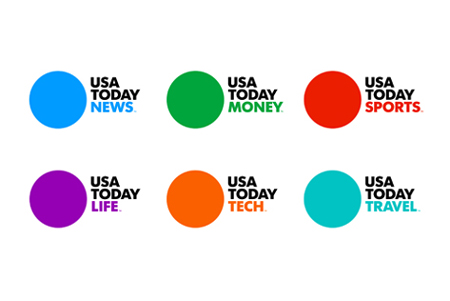
Basically, the new logo is a bit colorful dot, with the newspaper name written in Futura bold next to it. For each section, the dot’s color changes with the name of the section written in the same color as the dot.
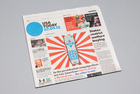
It’s a very minialist approach chosen by USA Today and Wolff Olins, the agency in charge of the redesign. It does work pretty well once you see it on the newspaper.


